10 Killer Panels from Jack Kirby
Celebrate the artist's 101st birthday by taking a look at ten panels that exemplify why Jack Kirby was the King.
This week, we're celebrating Jack Kirby's birthday by honoring the memory and legacy of one of the most influential creators in all of comic books and Marvel Comics. To celebrate, we're looking back at King Kirby's countless contributions to Marvel history all week here on Marvel.com.
Today, we're diving into ten of the most iconic Kirby panels!
BLACK PANTHER #10: page 17, panel 2
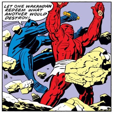
Kirby excelled at giant full and double page spreads, but he didn't need them to portray action. This panel demonstrates that beautifully.
Only one part of a six panel grid, it nonetheless captures the athleticism, agility, and resolve of the Black Panther. Leaping through debris that seems to be flying at him from every direction, T'Challa engages the pink monster that threatens to level a mountain destroying not only Wakanda but very likely the world along with it. He throws himself into the fight with zeal despite the danger, refusing to quit even as his solution very well kill himself in the process. Excellent action in just a sixth of a page.
CAPTAIN AMERICA #112: page 13
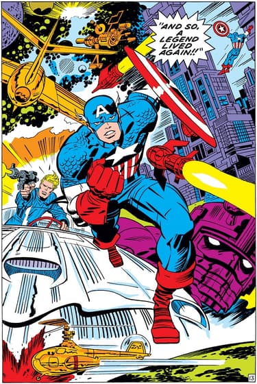
In a flashback issue that depicts Captain America’s return to life and his subsequent adventures in a summary style, this single page essentially could be the entire comic.
With one image, Kirby captures the heroism and dynamism of the late 1960s Steve Rogers. Additionally, it captures the breadth of adventures fans could witness Cap involved in at the time. Essentially, it acted as an incredible full page trailer for the Sentinel of Liberty.
THE ETERNALS #2: pages 2-3
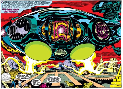
Kirby melds incredible technology and long-eroded ruins like no one’s business.
Paired with his own bombastic writing declaring that the “Gods Have Returned!” the image is an arresting one, full of power, awe, and fear as the central space craft absolutely dwarfs our protagonists.
FANTASTIC FOUR #44: page 12, panel 2
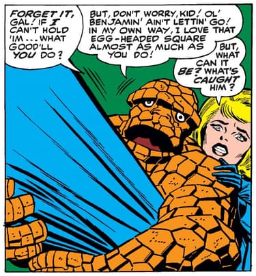
One of the underrated aspects of Kirby’s art has always been his ability to capture emotion. As the undisputed master of bombast and dynamism, that tends to dominant the discussion of his abilities. However, as we see here, he could also capture quieter moments with incredible precision.
The fear, confusion, and determination on the faces of Sue and Ben tell you all you need to know here. If you stripped out the dialogue, you wouldn't miss a beat about what these two are going through.
FANTASTIC FOUR #51: page 1
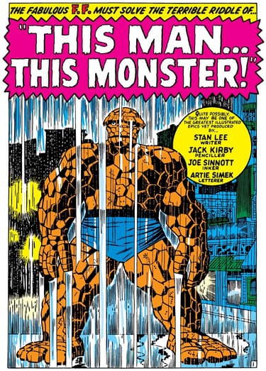
The sense of melancholy and emptiness is palpable in the Thing’s stance and the look on his face. Moreover the way he fills the panel not only conveys his size and thus his power—indicating the irony of how undone this hero can be by his own sadness—but also how central his own depression stands in his life. Here, Ben Grimm cannot conceive anything beyond himself in the depths of his despair.
FANTASTIC FOUR #74: page 15
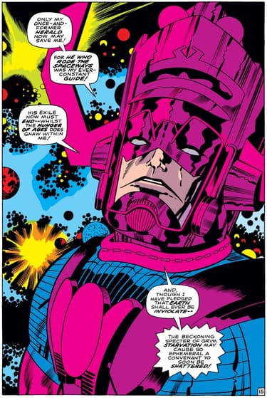
Here we find one of Kirby’s most universally beloved cosmic beings at one of his most alien, yet human, moments.
The hugeness of Galactus cannot be denied in the image, reminding us of the threat he represents and the size of his unquenchable hunger. He seems almost massive beyond our comprehension. Simultaneously, his empty stare paired with the dialogue makes it clear how uneasy he feels about the reality of his situation; his need to eat balanced against his desire to keep his pledge not to devour Earth.
FANTASTIC FOUR #87: page 5
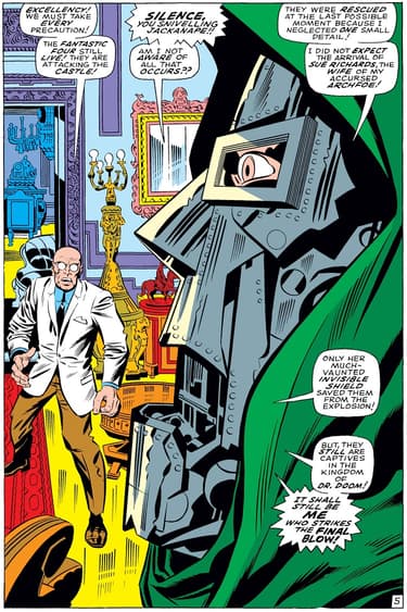
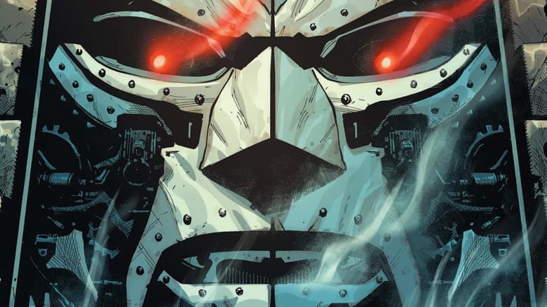
Perhaps one of the single best images of Doctor Doom ever.
Through forced perspective, his visage dominates his underling. His face appears large and unmovable; his eyes, seen through his mask, let us in on his humanity; his open mouth is a mass of circuitry, telling us how buried that humanity sits.
JOURNEY INTO MYSTERY #112: page 4, panel 1
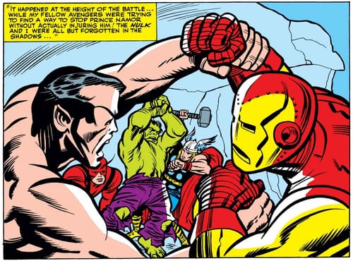
In an issue that revolves around a new clash between Goldilocks and Jade Jaws, the reader first finds Thor among people reminiscing about their previous clashes. The obvious choice would be to fill the panels and pages with God vs. Gamma action, and Kirby certainly delivers that, but early on, Kirby denies us that kind of thrill. Instead, he places the Hulk-Thor clash behind Iron Man and Sub-Mariner locked in a tussle.
In addition to teasing the battle to come, it also makes the point that Hulk-Thor fights never result in minor skirmishes. When they fight, their battles inevitably sweep others up in its earthshaking wake.
THOR #161: page 5
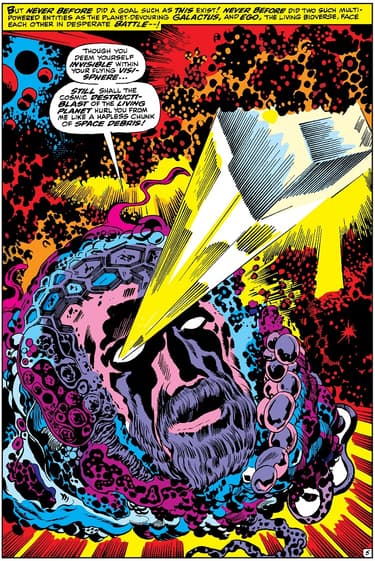
Kirby loved to bring a powerful splash page in around page 5, juicing the story during what often amounted to an expositional few pages, maintaining energy after his eye-catching openings.
Ego the Living Planet exists as such a bizarre idea and design that Kirby decided to introduce the reader to him early and with intensity. This image—striking, frightening, and unsettlingly strange—does the trick.
DEVIL DINOSAUR #1: page 2
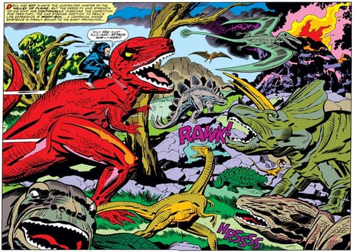
Pure cacophonous Kirby chaos.
The debut of one of the King's wildest creations, Devil Dinosaur, started with a bang. In the midst of smoke and fire, a collection of screeching prehistoric beasts crowd the page—with one in particular roaring directly at the reader, further pushing the action off the page and into reality.
Read more of the King's most memorable Marvel works on Marvel Unlimited, and stay tuned through the rest of the week as we celebrate his incredible legacy. You can also learn more about Jack Kirby through the Jack Kirby 100 celebration.
Keep the spirit of Jack Kirby alive by visiting the nonprofit foundation named in his honor: Kirby4Heroes! Visit the Kirby4Heroes website here for more info.
The Daily Bugle
Can’t-miss news and updates from across the Marvel Universe!
