Tom Muller on Designing the Evolution of X
The graphic designer recently won a Brand Impact Award for his 'Dawn of X' designs!
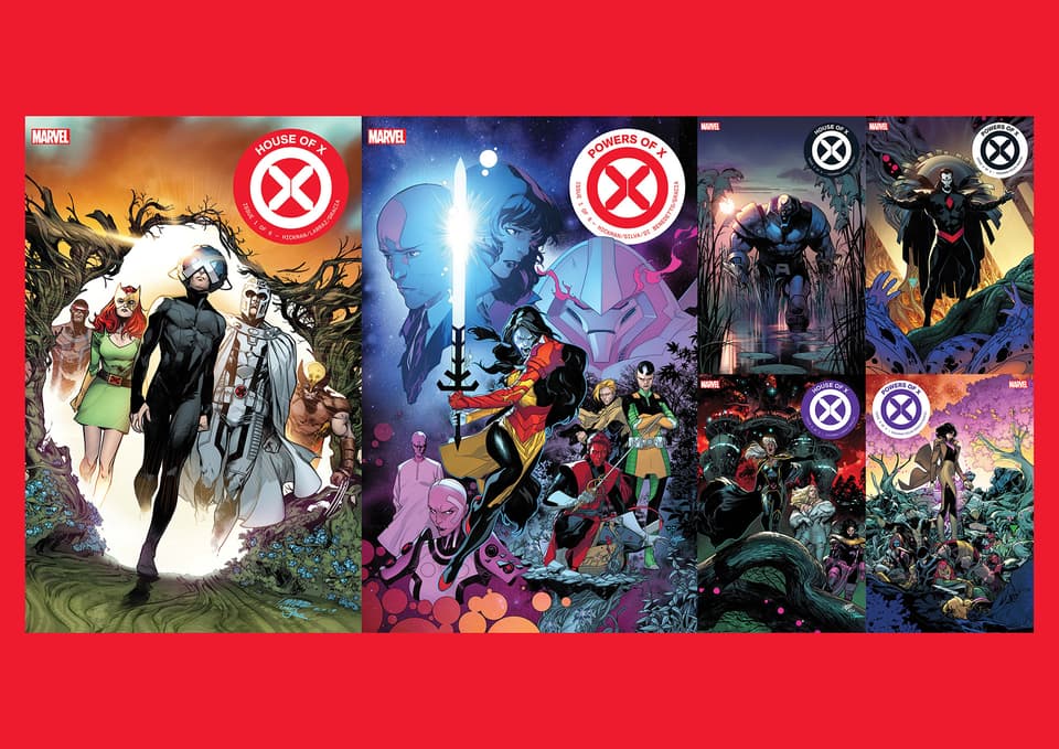
Last year, X-Men mastermind/writer Jonathan Hickman, artists Pepe Larraz and R.B. Silva, and graphic designer Tom Muller laid out the groundwork for the next phase of the mutant evolution — and welcomed Marvelites to the Dawn of X.
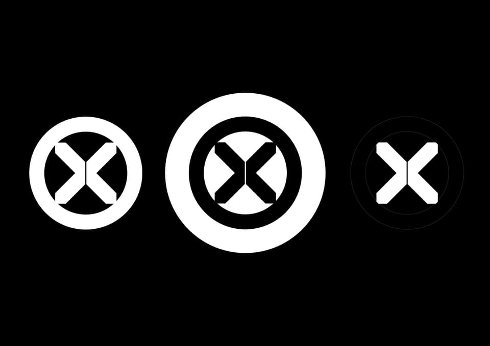
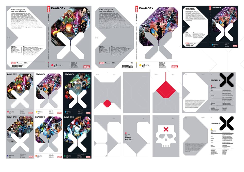
Recently Muller was recognized with a Brand Impact Award in the Publishing category for his work on the Dawn of X, which include a brand new X-logo, X-publications' logos, and interior designs.
With this recognition, Marvel.com had the opportunity to talk with Muller on his creative process, designing the next X-brand logo, and more.
Marvel.com: You were just recognized with a Brand Impact Award for your ‘Dawn of X’ work – congrats! Can you share with us how you got involved with this X-rebrand?
Tom Muller: I came onboard a few months before the initial HOUSE OF X / POWERS OF X announcement at C2C2 last year to start developing the new master ‘X’ mark, working with Jonathan [Hickman], and then later with Jordan White and Annalise Bissa of the X-Office developing the overall design direction for the relaunch.
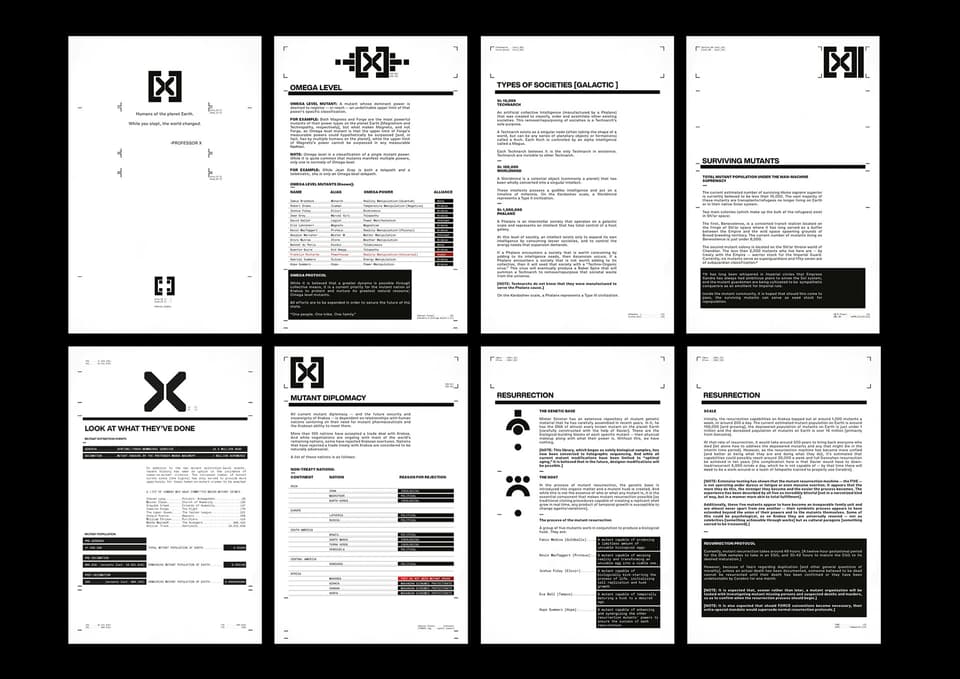
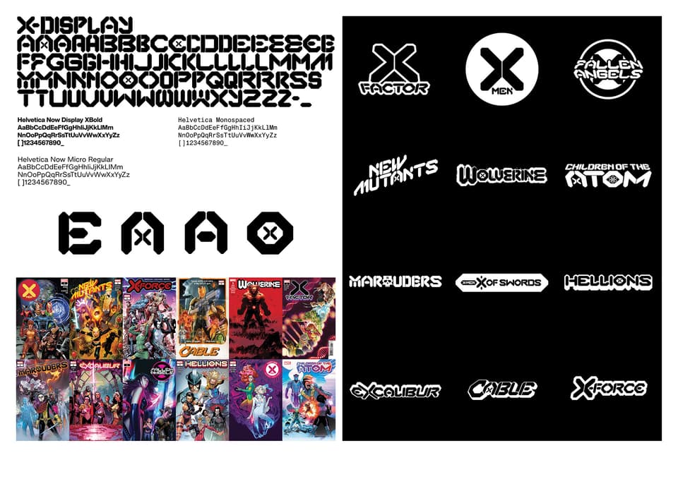
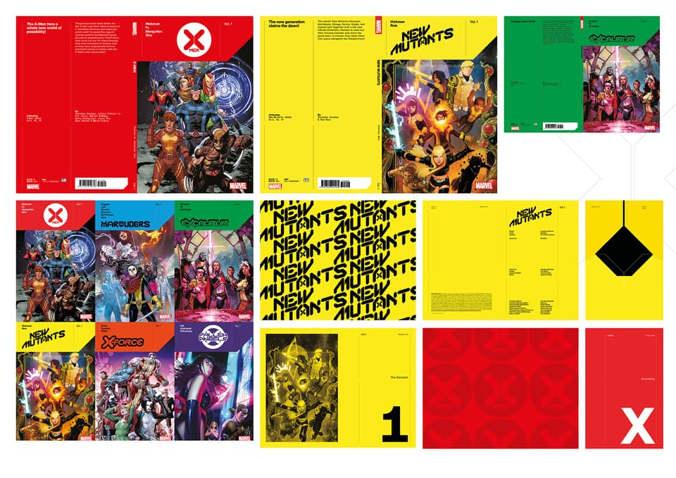
Marvel.com: The ‘Dawn of X’ initiative includes several titles including X-MEN, X-FACTOR, NEW MUTANTS, MARAUDERS, HELLIONS, EXCALIBUR, X-FORCE, etc. What’s great is that each of their masthead branding stands on its own but it’s clear they’re all connected. How did you approach giving each brand its own unique style?
Tom Muller: It became clear to me early on that in order to really emphasise that ‘Dawn of X’ was very much a fresh start for the franchise the best way to do so was to make sure that the family of mastheads all stem from that same family so every X-book is immediately recognisable in stores. I designed the ‘X DISPLAY’ typeface with that in mind as use it as the starting point to design each masthead and then customise it to fit each title; adding those individual touches that each series needs.
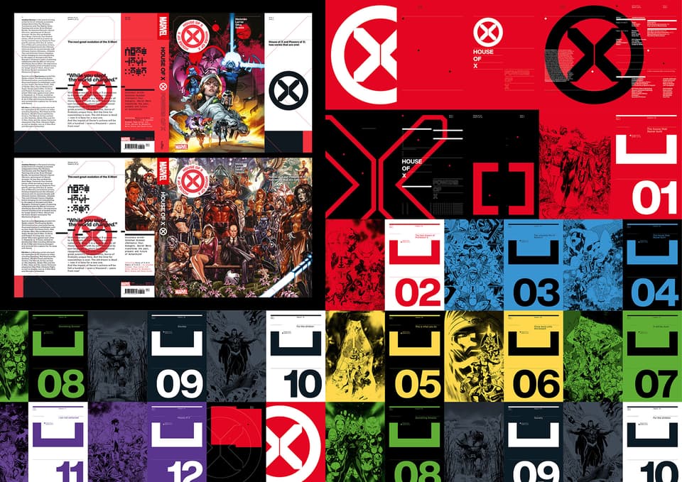
Marvel.com: Marvel fans are trained to look for hints and secrets in everything. Did you embed anything in your designs?
Tom Muller: Not necessarily. The design of the X DISPLAY typeface is based on the design of the ‘X’ mark; and the whole design language for the franchise incorporates elements of those shapes in every detail so this new ‘Design of X’ is visible everywhere.
Marvel.com: Which X-series logo is your favorite?
Tom Muller: That’s a tough one! I like them all because each one has an individual quirk that you won’t find in others. But to answer your question: The main X-MEN logo just works really well as a unit; I’m very happy with how we resolved having an ‘X’ in the NEW MUTANTS logo; The hidden sword shape in the X OF SWORDS masthead; and I’m really happy with how the masthead for the upcoming S.W.O.R.D. series came about.
Marvel.com: The X-Men have always been about evolution; how did you incorporate that into your treatment designs? What did you want to convey with the updated main X-logo?
Tom Muller: It was important to maintain a brand consistency within the new X logo with the classic X in a roundel; and like you say evolve the design to something that is more modern and future-forward. When I designed the mark I looked at a few things — the X-Gene, Mutant DNA strings, and looking at the idea of how the X-Men, and mutants have always pushed against bigotry. At the surface the ‘X’ looks like a cut of a DNA string; but the two halves can be seen as sides coming together; but also as two sides meeting and pushing against each other. There’s no definite interpretation; that’s for the fans to decide!
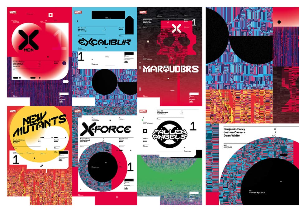
Marvel.com: In addition to the cover treatments, you also handle a lot of the in-book graphics like the data pages, how do you approach those pieces?
Tom Muller: I worked closely with Jonathan on those when HOX/POX was in development, creating the design approach, page layouts and defining the typefaces we’d use throughout — which Jonathan then applied to the Data pages you see in the pages of the X books. Jonathan is very well known for his design and use of data in his storytelling as well — so the lines blur when it comes to say where my work stopped and his began. Safe to say that all the amazing diagrams and stats you see in the Data pages are of Jonathan’s hand.
Marvel.com: What makes for a good design, and how can they help (or hurt) the story?
Tom Muller: I’ll answer in the context of comics. Good design shouldn’t rely on easy gimmicks and visual effects to make an impact. Good design should always push forward and be innovative; rather than be repetitive of styles. Good design makes an impact without overpowering the art and story; but rather it compliments and enhances it. It’s all about contrast and tension and creating a balance between the graphic quality of a logo and the art.
Marvel.com: Our readers may not realize it, but they’ll have likely come across your works with places like Wired, Entertainment Weekly, New York Magazine, The Guardian, MTV, PlayStation, film and record title treatments such as The Wolf of Wall Street, etc. You’ve now built an extensive portfolio within the comics industry. How did you get involved and transitioned over?
Tom Muller: I’m not sure if I transitioned over into comics completely. Comics are a very visible part of my work these days; while I still spend a lot of time working beyond comics — in digital and brand design both trough my own studio and with large agencies. I actually got my first break into the comic industry around 2001 when I started designing websites for artist Ashley Wood. This then evolved in book and brand design and built up to the point where we are today.
Marvel.com: What’s your Marvel origin story?
Tom Muller: My dad bought me my very first comic, which was a copy of the Dutch edition of AMAZING SPIDER-MAN #161 (growing up in Belgium it wasn’t until I was 15 I started reading imported American comics proper). And the rest is history.
Marvel.com: Lastly, do you have any advice for creators when it comes to designing their comic’s look and identity?
Tom Muller: If they can, work with a designer. They will always bring a fresh perspective to that comic; and the collaboration will usually yield a stronger design in the end. Look for design inspiration outside comics. Look at magazine publishing, packaging, signage, book design, film, video games, technology. Aim for design to be an integral part of the creation of the comic.
To learn more about Tom Muller and his works, visit hellomuller.com.
Continue Dawn of X weekly with Marvel Unlimited—and choose from over 27,000 more comics—right now! What will you be reading this week? Join the conversation at @MarvelUnlimited, and stay tuned to our Twitter and Facebook channels for more weekly announcements and updates.
For more of Marvel’s greatest comic books in print, please reach out to your local comic book shop to ask about services they may offer, including holding or creating pull lists, curbside pick-ups, special deliveries and other options to accommodate. Find and support your local comic book shop at http://comicshoplocator.com.
The Daily Bugle
Can’t-miss news and updates from across the Marvel Universe!
