You're Invited...To Marvel's Art Gallery!
Celebrate World Art Day with these comic artworks inspired by famous masterpieces!
80 years of Marvel Comics… shaped by thousands of years of history!
This World Art Day, we invite you to take a visit to our comics gallery to celebrate one of humanity’s greatest inventions—art!
Marvel artistry has always represented ingenuity and our human need for stories. In honor of that, we’ve curated a handful of comic pieces that pay homage to famous works from the Old World, to the Classical, and the contemporary.
VARIANT COVER TO AGE OF APOCALYPSE (2011) #2
REFERENCE: QUEEN NEFERTARI PLAYING SENET
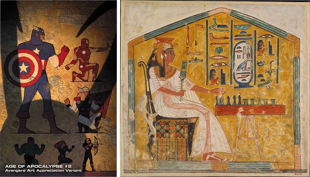
This 2012 Art Appreciation variant by Christian Nauck pays tribute to one of humankind’s first pictorial languages: the hieroglyphs of ancient Egypt.
Team leader Captain America is the primary figure, taking up the most space on the left. He’s flanked by assembled Avengers Thor, Iron Man, Black Widow, Hawkeye, and Hulk, while trickster god Loki looms in shadow. Each member is in side view against a stone background, striking their signature pose. The piece is vibrantly colored, much like the hieroglyphs that recorded annals of history in pyramids, tombs, and temples.
Queen Nefertari Playing Senet is a remarkable example of hieroglyphic art. Seated on a decorative chair while playing a leisurely game of Senet, Nefertari’s rank as Ramesses the Great’s Royal Wife is asserted by her size and position.
VARIANT COVER TO INVINCIBLE IRON MAN (2008) #515
REFERENCE: MOAI STATUES
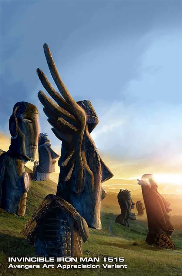
Earth’s Mightiest Heroes become monolithic stone in this Art Appreciation variant by Greg Horn. All keep their identifying features, like Iron Man’s Arc Reactor, or Hawkeye’s quiver of arrows. They appear to have stood there for millennia under a dusky sky.
This cover depicts the religious and political totems of the Rapa Nui people, who populated the land craters of Rano Raraku on Chile’s present-day Easter Island. Nearly 900 figures were constructed between 1250 and 1500 CE, some now partially buried or destroyed, others still standing tall in their enigmatic glory. While archeologists can only guess at their true purpose, their careful arrangements seem far from ornamental.
The moai are recognizable for their broad, human faces. Maybe they are ancestors or spirits, still watching over sacred land.
INTERIOR FROM CIVIL WAR II (2016) #8
REFERENCE: LA PIETÀ
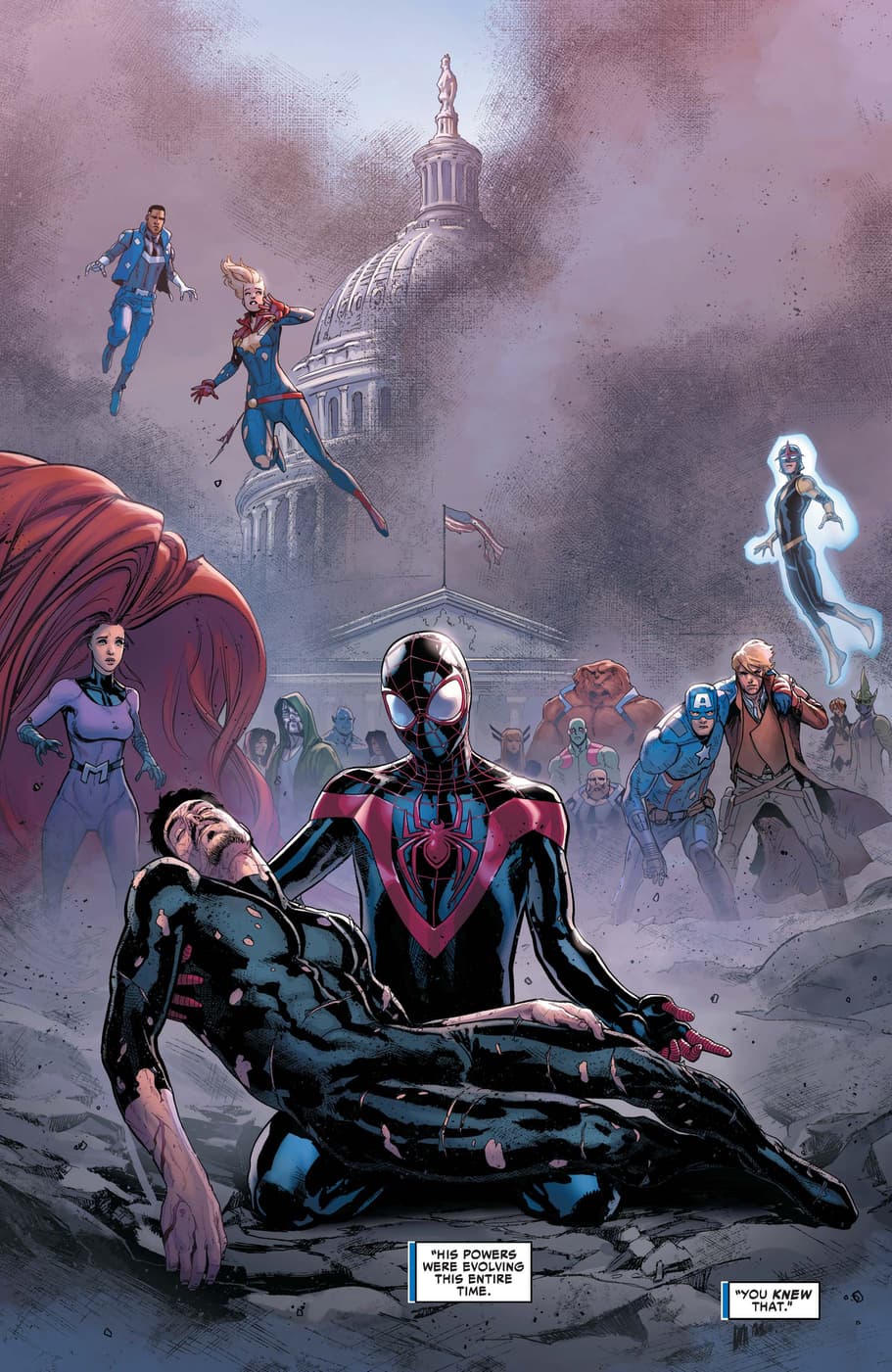
This full page interior from CIVIL WAR II #8, with pencils by David Marquez and colors from Justin Ponsor, was a capstone moment in the big, bad beef that brewed between Iron Man and Captain Marvel.
Teen hero Miles Morales: Spider-Man was caught dead center in this superhuman conflict, and a prophesy of Tony Stark’s demise in Washington, DC placed him at the scene. The truth was far more complicated of course, but we still got this impactful page that mirrors Michelangelo’s La Pietà, or “The Pity,” one of the Vatican’s most famous works.
Miles cradles a wounded Tony Stark in the forefront, his right hand extended in a supplicating gesture. Tony’s neck remains unsupported, while his limp body drapes across Miles’ kneeling form. The battle worn heroes look on in horror.
Miles and Tony’s poses are reminiscent of the Virgin Mary and Jesus in La Pietà. In the statue, Mary holds her son in a final, maternal embrace, her folded robes collecting in pleats as she kneels. Considered the height of classical beauty and Renaissance form, La Pietà is one of the most recognized religious works.
VARIANT COVER TO UNCANNY X-FORCE (2010) #24
REFERENCE: A SUNDAY AFTERNOON ON THE ISLAND OF LA GRANDE JATTE
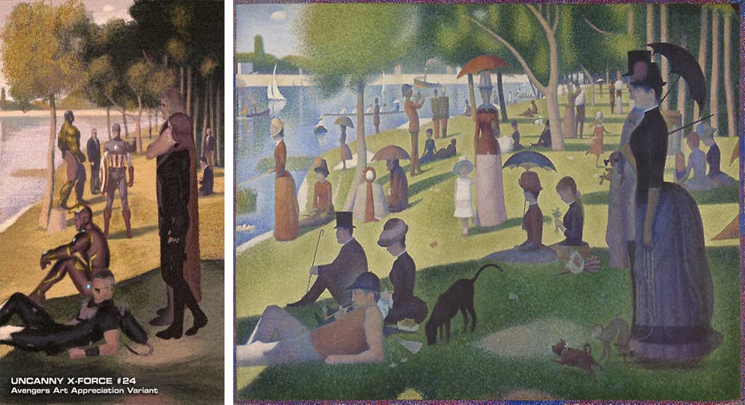
The Avengers go post-Impressionistic in this Art Appreciation variant by Julian Totino Tedesco, showing a casual kind of Sunday where each member gets to kick back and relax along the banks of the River Seine (or the Hudson).
The visible pointillism, or dotted brush strokes, is a callback to Georges Seurat’s most famous work. The overhanging shadow on Thor, Black Widow, Iron Man, and Hawkeye, epitomizes the play of light that was a key part of the Impressionistic and Neo-Impressionistic movements. The rigidity of each figure, lost in their own reveries, exemplifies tension between movement. The fine brushstrokes are active, yet the figures are still.
A Sunday Afternoon on the Island of La Grande Jatte has an unusual composition for its painted frame, a nudge that it’s “fine art.” The humans (and animals) are simplistic in shape, signifying a shift of figural suggestion over realism.
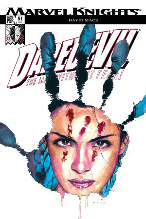
INTERIOR FROM DAREDEVIL (1998) #51
REFERENCE: SELF-PORTRAIT
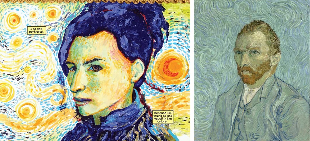
One heckuva arty issue!
In part one of “Echo,” artist David Mack uses his collaged style to tell the origin of Daredevil protagonist, Echo, AKA Maya Lopez. His pages spill over with art references throughout history, so we’ll just take you to the issue.
A musical and artistic prodigy, Echo takes us inside the inner gallery of her mind, a distorted world of floating images and disembodied words. One of her self-portraits, modeled after Dutch painter Vincent van Gogh, is a three quarter view from the shoulders up, placed in front of a swirling background that pulls in elements from The Starry Night. Broad brushstrokes evoke the passage of time, as well as the physical relationship between the artist and her canvas.
Van Gogh’s art has tons of emotionality, a true marker of Neo-Impressionism. The blending of light and figures took place directly on the canvas as opposed to his palette. In his Self-Portrait from 1889, his seated figure is far from static. While Van Gogh never saw commercial success in his lifetime, he is now one of the most celebrated artists, and self-portraitists, of all time.
INTERIOR FROM DAREDEVIL (1998) #51
REFERENCE: THE THREE AGES OF WOMAN
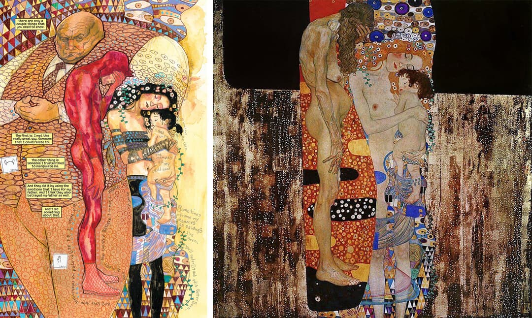
Our second piece from David Mack’s DAREDEVIL issue is a great example of Art Nouveau, packed in composition. Echo’s work is a symbolic one too, and like Klimt’s painting, it has a Byzantine quality with all that gold.
As opposed to three figures, we get four. The menacing Kingpin dominates the page, clinging to the left as the most sinister force in Echo’s life. Daredevil replaces the older woman, while the small child is the memory of Echo’s youth.
In Klimt’s piece, the artist achieves a gilded aesthetic through oil paint. His three figures represent human at varying life stages. There’s an elderly woman on the left shielding her face from view. She is downcast, the raw effects of age having taken their toll. Although barefooted, she’s far from carefree. Very unlike the central figure, a young woman with a floral wreath and legs loosely draped in fabric. She serenely cradles a baby, the first “age” of woman. The background looks textured too, almost like stucco.
INTERIOR FROM DAREDEVIL (1998) #51
REFERENCE: LES DEMOISELLES D'AVIGNON
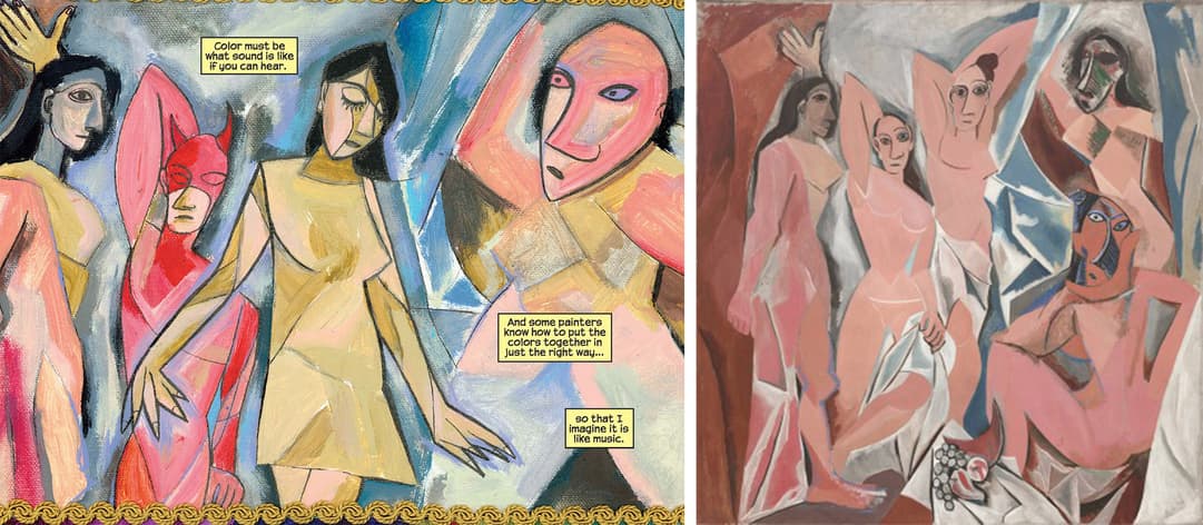
Our third and final piece from DAREDEVIL #51.
In Echo’s masterpiece, we are confronted by four figures crowded onto a canvas that feels too small. All are in different states of abstraction, with bodies that are more cubic than human. The figure on the far right is the most crude. We are unsure of the painting’s location—the subjects appear haphazardly placed.
One of the forefathers of Cubism, Pablo Picasso’s Les Demoiselles d’Avignon, or “The Young Ladies of Avignon,” is an early example of his deconstructed figures. In the painting, five nude women stare unapologetically at the viewer, inviting us in as voyeurs to their strange assembly. There is nothing conventionally beautiful about this piece—it’s actually discomforting.
VARIANT COVER TO THE AMAZING SPIDER-MAN (1999) #592
REFERENCE: SALVADOR DALÍ, THE PERSISTENCE OF MEMORY, 1931
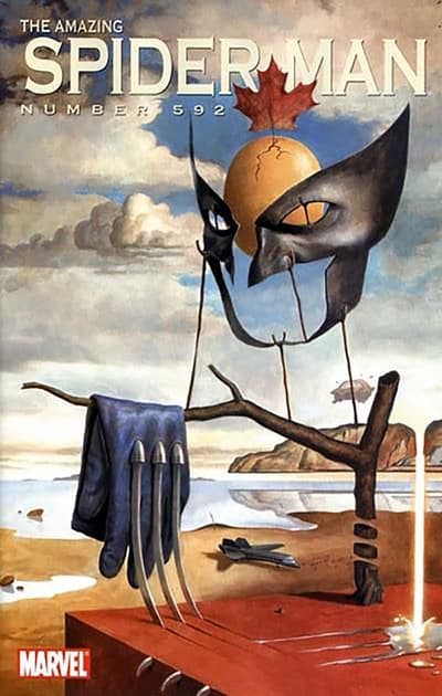
Wolverine gets a Dalí makeover with this variant by Paolo Rivera.
The character’s trademarks are picked apart then isolated, carefully arranged in a barren landscape. On the right, a dwarfed tree with a single branch holds Wolverine’s gloves, weighted down by melting claws. The twig-tree’s trunk has been SNIKT’d though, so this whole arrangement is an impossible balance. In the middle ground, the solitary Blackbird lies in wait, deprived of action. Our perspective on the background is distorted—we’re not quite sure where the land and sea collide.
Salvador Dalí’s The Persistence of Memory, an oil on canvas in New York’s Museum of Modern Art, has the same visual language as this cover. A master of Surrealism, Dalí’s “melted” dreamscapes challenge the viewer’s sense of scale. In “Memory,” three limp clocks have collapsed across a wasteland, while another gold timepiece has been infested by ants. In the center, a weird fleshy mound has similarly deflated. This could be a face, a flap of skin, or something completely alien.
INTERIOR TO X-FACTOR (2005) #5
REFERENCE: EDWARD HOPPER, NIGHTHAWKS, 1942
Rictor, a seismic-controlling mutant who was then a part Multiple Man’s detective agency, popped his head into a New York City diner looking for his missing teammate, Siryn. In this opening panel, artists Dennis Calero and Jose Villarrubia established the noir-ish tone of the issue.
Edward Hopper’s Nighthawks, an oil on canvas that’s on display at the Art Institute of Chicago, is a clear inspiration. Rictor intrudes on a scene of four solitary figures, distantly placed from the viewer behind glass windows. All are seated in an unnaturally lit diner. The streets are empty, these folks are the only ones up. The shadows are an important part of the storytelling in Nighthawks. The figure in the foreground has his back turned to us—he’s largely in the dark and so are we. Many describe Nighthawks as “lonely.”
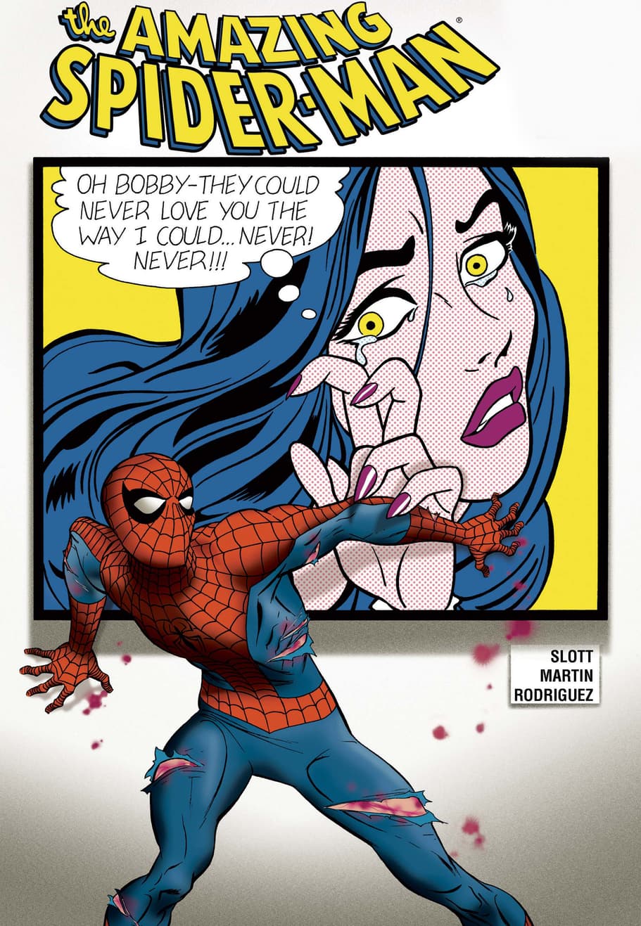
COVER TO AMAZING SPIDER-MAN (1999) #560
REFERENCE: ROY LICHTENSTEIN, CRYING GIRL, 1963
It’s Spider-Man vs. Pop art on this cover by Marcos Martin.
Here, everyone’s favorite Wall-Crawler becomes another piece in the exhibit, standing in front of a Roy Lichtenstein-inspired work featuring a weepy young woman. She looks like she was plucked from the page of a romance comic drawn by John Romita.
At the crux of the Pop art movement was an embrace of mass consumerism. Commercial art was elevated to “fine art,” a line in the sand that Pop artists continually pushed. Lichtenstein’s paintings are evocative of a 1960’s comic, right down to the Ben-Day dots. Crying Girl from 1963, a lithograph on lightweight paper, takes after the four-color printing process of Cyan (C), Magenta (M), Yellow (Y), and Black (K), used in early comic production.
We hope you’ve enjoyed your visit! Looking for more artistic inspiration? Head to Marvel’s Twitter.
Research and curation by Emily Kimura.
With Marvel Unlimited you can read these comics—and choose from over 27,000 more—right now! What will you be reading this week? Join the conversation at @MarvelUnlimited, and stay tuned to our Twitter and Facebook channels for more weekly announcements and updates.
To find Marvel’s greatest comic books in print, please reach out to your local comic book shop to ask about services they may offer, including holding or creating pull lists, curbside pick-ups, special deliveries and other options to accommodate. Find and support your local comic book shop at http://comicshoplocator.com.
The Daily Bugle
Can’t-miss news and updates from across the Marvel Universe!
