Navigate A Universe of Wonders with 'Marvel Universe: Map by Map'
Explore the ever-expanding, complex, and interconnected Marvel Universe on November 16!
Get ready to navigate worlds of wonder. Take a voyage across space and time. Explore the Marvel Universe as never before.
DK Books, in partnership with Marvel Entertainment, is releasing Marvel Universe: Map by Map, a premium, lavishly illustrated compendium of specially curated essays, boasting stunning, newly commissioned maps, illustrations, and diagrams, exploring iconic Marvel locations. This hardcover collection hits shelves on November 16, 2021, everywhere books are sold. Pre-order now!
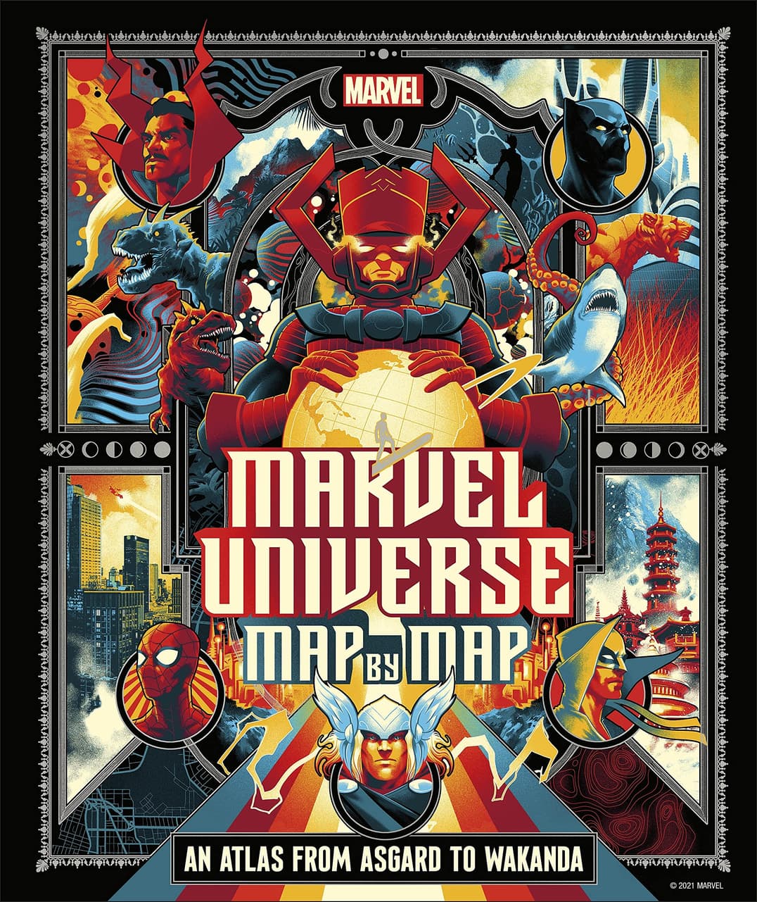
Chart a journey across Marvel Comics' vast and vibrant universe, from its Earthbound mean streets and hidden lands, to its mythic realms and cosmic outer reaches. This Marvel-approved compendium of specially curated essays features stunning, newly commissioned cartography, illustrations, and diagrams to help readers navigate their way around iconic locales such as Asgard, Wakanda, Atlantis, Olympus, Hell's Kitchen, Latveria, Knowhere, The Savage Land, Battleworld, and many more.
Marvel Universe: Map by Map delineates the contours of the ever-expanding, complex, and interconnected Marvel Universe, illuminating the incredible locations, epic events, and extraordinary characters that have shaped it. Boasting dazzling new artwork, gorgeous comic book visuals, and insightful, authoritative text, this is a premium, indispensable way finder for any armchair explorer.
Marvel.com had the opportunity to speak with Cefn Ridout, senior editor at DK Licensing, as well as illustrators Matt Taylor and Andrew DeGraff, about the exciting project!
Marvel.com: What was your approach to tackling the entire scale of the Marvel Universe?
Cefn Ridout: We clearly couldn’t include the entirety of the ever-expanding Marvel Universe in a 240-page book, even a coffee table-sized one, so we honed our criteria to the most iconic locations with storied histories that featured significant characters. Geographically, we also had to find as many locations as possible with existing maps that could be used as reference for our artists, so the Marvel Handbooks came in very handy.
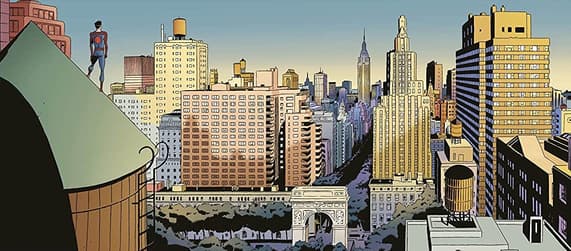
As a framework, we took a telescopic look at the MU. Starting with Super Hero Central in Manhattan, we zoom out to explore Earth’s super-powered nations, as well as the planet’s arcane regions, hidden kingdoms and lost lands. Then we travel into outer space to explore intergalactic empires and key cosmic outposts, after which our perspective widens to enter the otherworldly and ethereal realms of sorcerers, gods and demons. Finally, we cross the threshold of reality to glimpse alternative Earths and divergent timelines.
Marvel.com What can maps and topography reveal about the rich, vast Marvel Universe?
Cefn Ridout: At the risk of sounding highfalutin, maps do more than get you from A to B, they fire the imagination. They inspire questions like "Who lives there and what events shaped the land and the people?” As such, maps have always been vistas of storytelling, prompting journeys of the mind and the promise of discovery and adventure. And you’d be hard pressed to visit more exciting and wondrous locations than the Asgard, Atlantis, Wakanda, Monster Island, the Living Planet Ego, and the Skrull and Kree Empires—to name just a few.
In Marvel Universe: Map by Map, the maps set the scene, giving you an overview of the iconic locations, their geographical position (where possible) and, supported by insightful essays, distills their history and importance.
Marvel.com: Can you share some of the artists featured in this title and how they were curated?
Cefn Ridout: From the outset, we knew the book had to be highly collaborative and would showcase the work of a range of distinctive illustrators. So, we played to the strengths of each artist selecting locations that would best suit their approach and style. Needless to say, they’re all highly accomplished artists whose work exhibits a strong sense of place and storytelling, and they all gave their utmost to Marvel Universe: Map by Map.
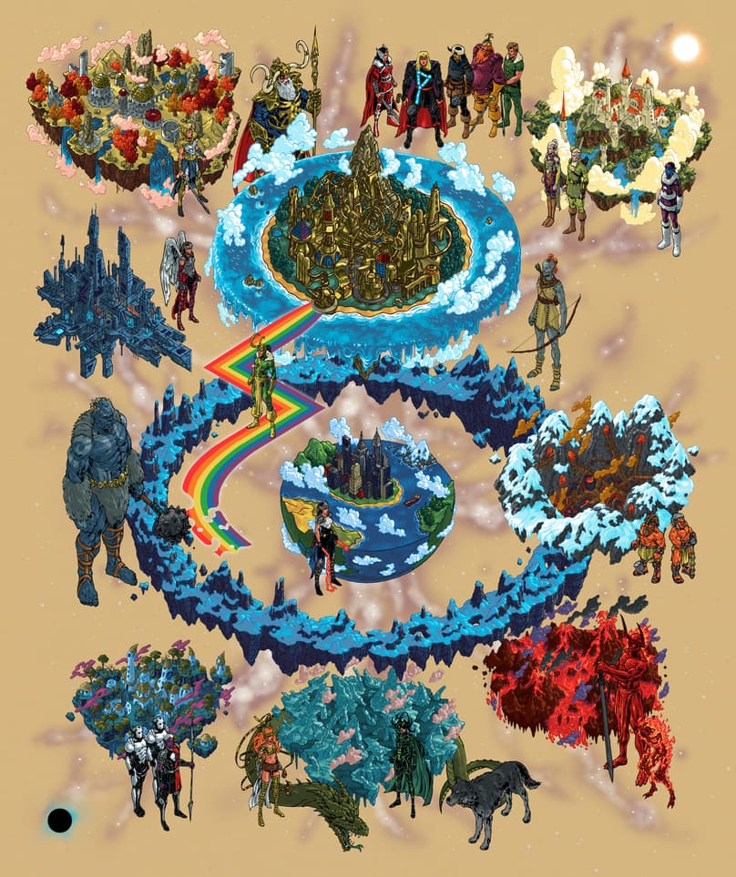
Andrew DeGraff is a pop-culture cartographer par excellence, known for his meticulously intricate maps that outline the paths of major characters as they move through their fictional landscapes. His Cinemaps: An Atlas of 35 Great Movies, won the Frankfurter Buchmesse Film Awards “Best Illustrated Book on Film.” So, it seemed only fitting for him to depict the likes of the epic, multifaceted Ten Realms of Asgard, the Seven Capital Cities of Heaven, and cosmic civilizations.
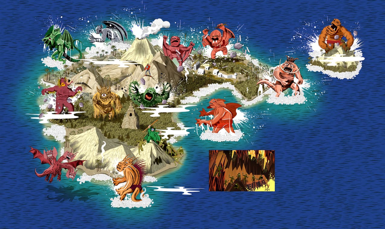
Adam Simpson’s stylized and dazzlingly detailed artwork has graced projects great and small from large-scale murals to commemorative stamps, and everything in between including posters, books and magazines. We felt his immersive, highly textured style would be perfect to embellish and enhance preexisting Marvel maps for locations as varied as Manhattan, Savage Land, Battleworld and, of course, Monster Island.
Matt Taylor, who also provided the fantastic cover—a modern riff on Victorian-era book jackets—is a creative collage maestro, weaving together key places, characters and story strands in vibrant, evocative, ingeniously composed panoramas. So, who better to make graphic sense of the geographically dispersed Atlantis and Krakoa, the temporally dislocated alternate earths, and the phantasmagorical mystic realms?
Marvel.com: The topography of the Marvel Universe is broken up into Prime Earth, Lost Lands, The Cosmos, Ethereal Realms, and Other Dimensions. What was the most exciting/complicated locations to map out?
Cefn Ridout: To be honest, they all presented their own challenges and rewards in different ways. Where we had the advantage of referencing pre-existing maps, either from Marvel handbooks or newly created versions such as Ta Nehisi Coates and Manny Mederos’s Wakanda or Jonathan Hickman’s Krakoa, we still had to choose what to include or leave out. This often came down to how best to tell the story of these locations, which would be expanded on in the accompanying essays.
Where there were no existing maps or just fragmentary/simplified ones, for regions such as The Cosmos, Mystic Realms, Alternate Earths, or the Infernal Domains, we worked with the artists and authors to visualize these based on whatever Marvel (or external) location reference and related key story arcs we could find. We felt this would give readers some sense of the scope and relative position of places. For instance, our model for Infernal Domains was Dante’s Nine Circles of Hell, while Matt came up with the brilliant idea of framing the alternate earths around an orrery, and we largely mapped The Cosmos around the rise and fall of alien empires and the actions of vital cosmic players such as Galactus, the Silver Surfer, Thanos and the Watcher Uatu.
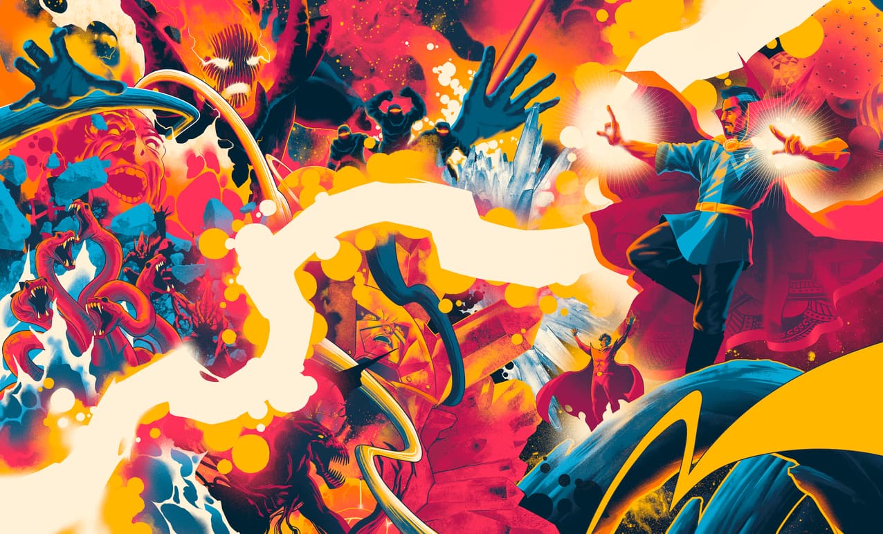
The most exciting experience was on Mystic Realms, not just because it was the final map to go in the book, to which we added the Mindless Ones at the 11th hour, but because this is, I think, the first time many of these fabulous dimensions have been gathered in one place and we were able to pay homage to their visualizer, the great Steve Ditko.
Marvel.com: How much research went into this title?
Cefn Ridout: A lot, especially image research. Once we’d distilled everything down to which regions, landmarks, stories and characters best represented our final locations, our image researcher spent many, many hours digging out whatever images we could find from a vast array of comics for the artists to use as visual references. Some of the artists are well-versed in Marvel comics lore and had their own collections/sources to hand, which certainly helped, while others came up to speed fairly quickly after we furnished them with umpteen comic panels and pages.
We also provided general visual reference for the style we thought would work best for the different maps: topographical, star charts, diagrammatic, stylized, etc. Of course, the artists used these as jumping off points and came up with something far better than we had envisaged.
Marvel.com: Matt, what went into building the Mystic Realms? Can you share some early sketches for this piece and how it came together?
Matt Taylor: Of all the maps I worked on, Mystic Realms provided a unique set of challenges. While all my other illustrations in the book required me to either map an environment that hadn’t been mapped before or wrangle locations that moved around as the comic stories required, Mystic Realms was neither of these. It was the space between spaces... dimensions of madness and chaos birthed by Steve Ditko’s madcap creativity; it pushed the definition of “map” as far as it could go. There was so much visual reference and different artists’ interpretations that it was difficult to know where to start. So, I decided to lean into that creative spirit and go a little crazy.
The author (James Hill) suggested using the Winding Way to anchor the page, with Dr Strange and Dormammu as focal points. I roughly devised a circular composition, with concentric circles emanating out from the bottom left corner and following the path of the Winding Way. Once I had the layout I started slotting in imagery from the different dimensions, and where they intersected, I threw in some Ditkoesque abstract patterns and Jack Kirby “krackle” to keep them from running into each other. I’ll never pass up the chance to draw some cosmic weirdness, so this was probably the most fun I had working on this project – there was a reason I saved it for last!
The drawing was a delicate balance of infusing as much craziness as I could and still make it a readable image. Luckily, I was blessed with an art director and editor who had faith me when I showed them a sketch that was borderline unintelligible and said “trust me, it’ll be fine.” (Editor’s Note: The book’s Marvel reviewers also gave Matt creative leeway as his many MCU posters perfectly demonstrated the finished look of his artwork.)
The work I did for Map by Map is some of my favorite Marvel Universe art. It was a pleasure to work across the spectrum of MU’s locations and characters, and I can’t wait to share it with people!
Marvel.com: Andrew, what went into building the Ten Realms of Asgard? Can you share some early sketches for this piece and how it came together?
Andrew DeGraff: I grew up on Marvel Comics, and they've been a huge influence on me. Thor, in particular, was pretty special, so the Ten Realms of Asgard was a treat. Initially, I played with the idea of hemispherical planets that were perhaps a little too married to a cosmic aesthetic, and focused on creating wildly different landscapes. Next, we added characters to contextualize the Realms, which really helped to clear up the icier regions of Niflheim, Nidavellir, and the Jotunheim. Before going to final, we “un-planeted” the realms, envisioning them as sort of floating magical islands, which I think really works. Asgard remains a sort of utopian disc, while the others are more organic. Midgard/Earth remains the only hemispherical world, as it’s not on the same purely mystical plane as the others.
Process wise, the line artwork was created with brush and ink, scanned and painted in large files, and finally digitally collaged together. I used the same starting palette of around thirty colors, expanding the number when needed. That way the Realms and characters would be painted with the same palette so they wouldn't feel disconnected. The color is created by scanning a few pieces of toned paper and digitally manipulating them into different color ways. I like working this way because it builds a slight undulation in the final result, lending it a hint of texture. The color is painted from dark to light, so the initial layer is a deep base tone and each pass gets lighter, making it easier to tweak light and form. Most areas get three passes: a dark tone, a middle and a highlight, but some require a few more. It’s very much an assembly line process and the final digital painting took around 50 hours.
Marvel.com: Adam Simpson, Matt Taylor, and Andrew DeGraff all have very distinct styles. How did select which locations best suited their artistic preference, while also highlighting the cosmic, earth-based, prehistoric, and mystical elements of these destinations, or were the illustrators able to select the corner of the MU they wanted to explore?
Cefn Ridout: To save time, as we knew this book had a lot of moving parts with various stages along the way, we were keen to allocate maps ahead of time based on the style of the artists we wanted to work on the book. As luck would have it, we appear to have matched artists to Marvel locations for which they hold some fondness. Well, at least that’s what they told us.
Thanks to our friends at DK Books, we have an exclusive preview of the process pieces that went into "Ten Realms of Asgard" and "Mystic Realms" in the galleries below!
Pre-order Marvel Universe: Map by Map now and get it on November 16!
Want to stay on top of everything in the Marvel Universe? Follow Marvel on social media—Twitter, Facebook, and Instagram—and keep watching Marvel.com for more news!
The Daily Bugle
Can’t-miss news and updates from across the Marvel Universe!
